Year:
2026
Tools:
Adobe Illustrator, Figma
Category:
Branding / Visual Identity

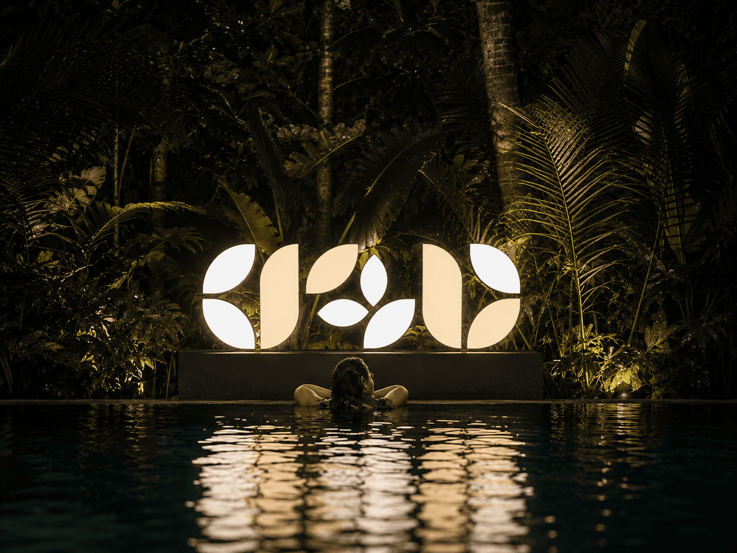
Overview
Transforming a resort's identity to feel calm, considered, and unmistakably its own.
Hospitality branding often defaults to the same visual language, generic scripts, ocean-blue palettes, stock luxury cues. By building a mark with real meaning behind it and a distinct natural palette, we create an identity that feels specific to Regal Bee rather than interchangeable with any other resort.
Problem
Most resort brands lean on decoration rather than distinction, a nice-looking logo with nothing tying it back to the property itself. Regal Bee needed an identity that could scale across everything from room tags to signage without losing meaning or feeling like a generic luxury template.
Solution
A custom mark built entirely from leaf-shaped forms, doubling as the letters R and B and a bee at its center, paired with a deep olive palette that echoes the resort's natural setting. The result is an identity with a built-in story, functional at any scale, but rewarding a second look once someone notices the bee hidden in the negative space.


